Eroica
Eroica
Create a font for a graduation exhibition
Create a font for a graduation exhibition
Typography
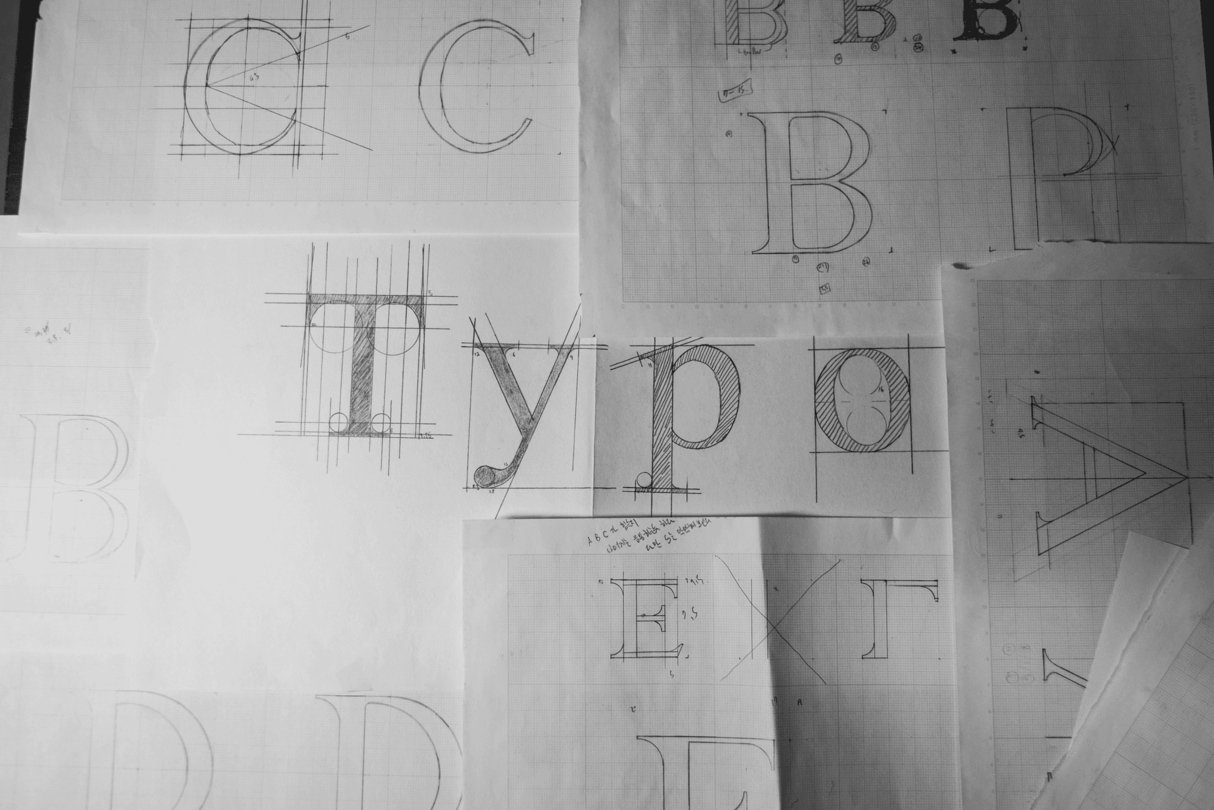

Type
Type
Graduate Exhibition Project
Graduate Exhibition Project
Timeline
Timeline
Aug 2017 - Oct 2017
Aug 2017 - Oct 2017
Aug 2017 - Oct 2017
Times Eroica is an English typeface designed for both title and body text, created for the 2017 graduation exhibition of Seoul Design High School. It was modeled after Times Roman and served as a project through which I studied many aspects of typography, the foundation of visual design, from the history of Latin typefaces to their design characteristics and optical illusions.
Times Eroica is an English typeface designed for both title and body text, created for the 2017 graduation exhibition of Seoul Design High School. It was modeled after Times Roman and served as a project through which I studied many aspects of typography, the foundation of visual design, from the history of Latin typefaces to their design characteristics and optical illusions.
"The simplest way to learn typography"
"The simplest way to learn typography"
Background
Background
Although I received basic training in color, infographics, and typography at school, I always felt that my understanding of Latin typefaces was lacking, perhaps because my design education was rooted in a Korean-speaking environment.
I’ve always dreamed of working with diverse people overseas, and with that in mind, I set a goal to study English typography on my own and eventually create a typeface.
After several attempts, I realized that there is a certain level of entry barrier to typeface design. I read many books and resources, and even reached out to type designers at type design studios to have conversations with them.
Design Process
Design Process
Goal Set
Research / Design Concept
Sketch
Digitization
Adjust Detail
Publishing
Research
Research
Model Font : Times Roman
Model Font : Times Roman
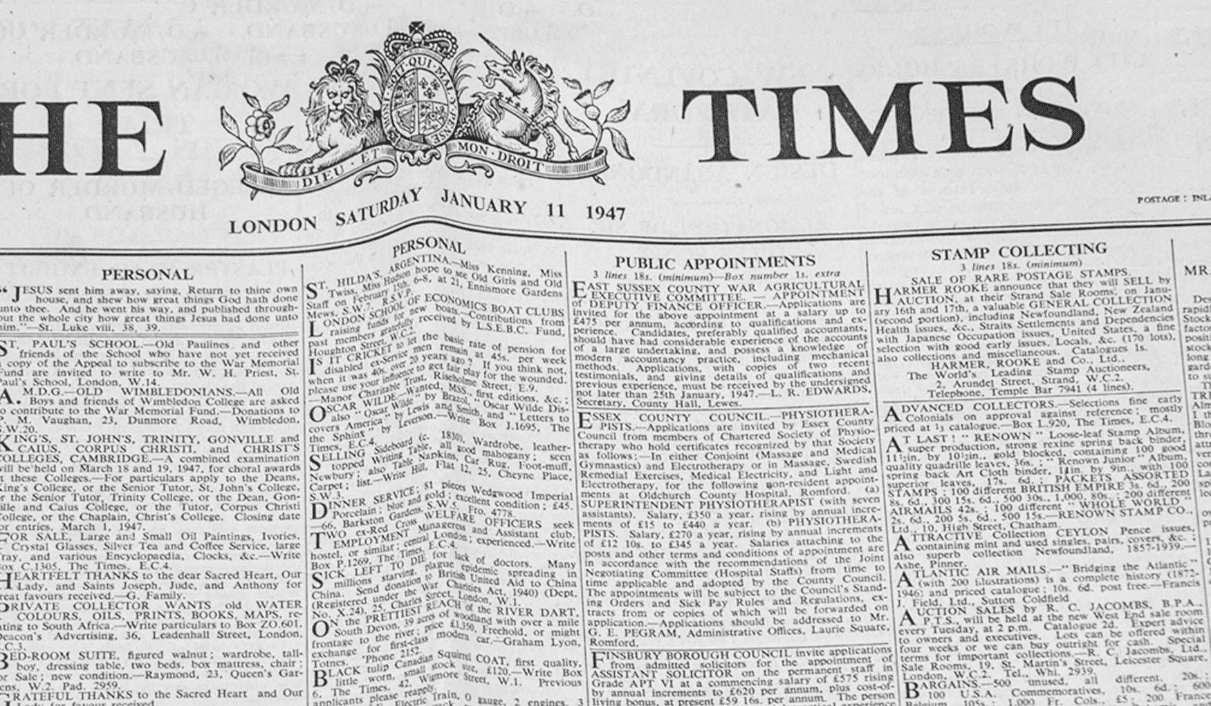
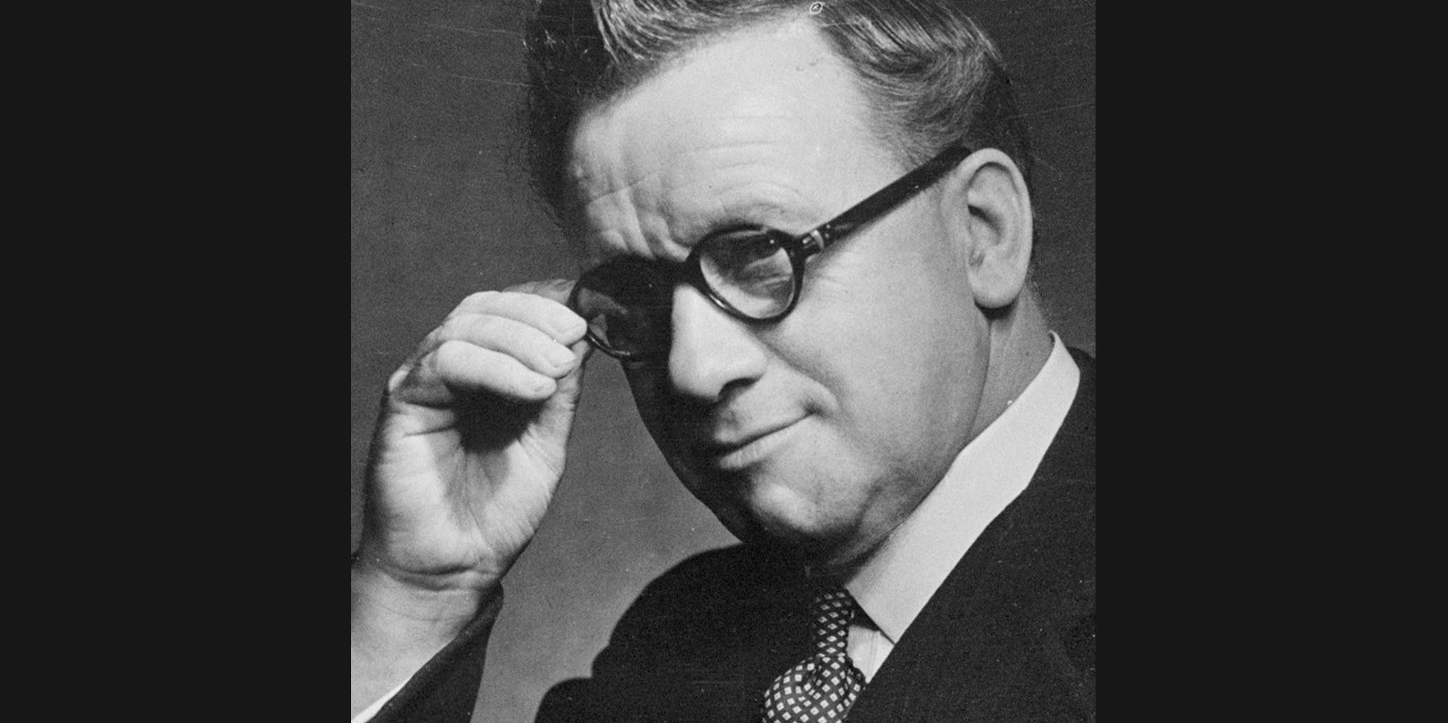
Given the limited time, I decided to create variations by modifying an existing font rather than developing something entirely new. I chose Times Roman as the model, a typeface originally designed by Stanley Morison for The Times. Known for its strong contrast and readability, Times New Roman is efficiently proportioned, both in individual letters and in full sentences.
I selected Times New Roman due to the potential for modification and reinterpretation seen in its variations like Times Europa (1972), Times Millennium (1997), and Times Classic(2001).




A
B
C
D
E
F
G
H
I
J
K
L
M
N
O
P
Q
R
S
T
U
V
W
X
Y
Z
A
B
C
D
E
F
G
H
I
J
K
L
M
N
O
P
Q
R
S
T
U
V
W
X
X
Y
Z
Stanley Morison / Times New Roman
Idea
Idea
Sound to Image
Sound to Image
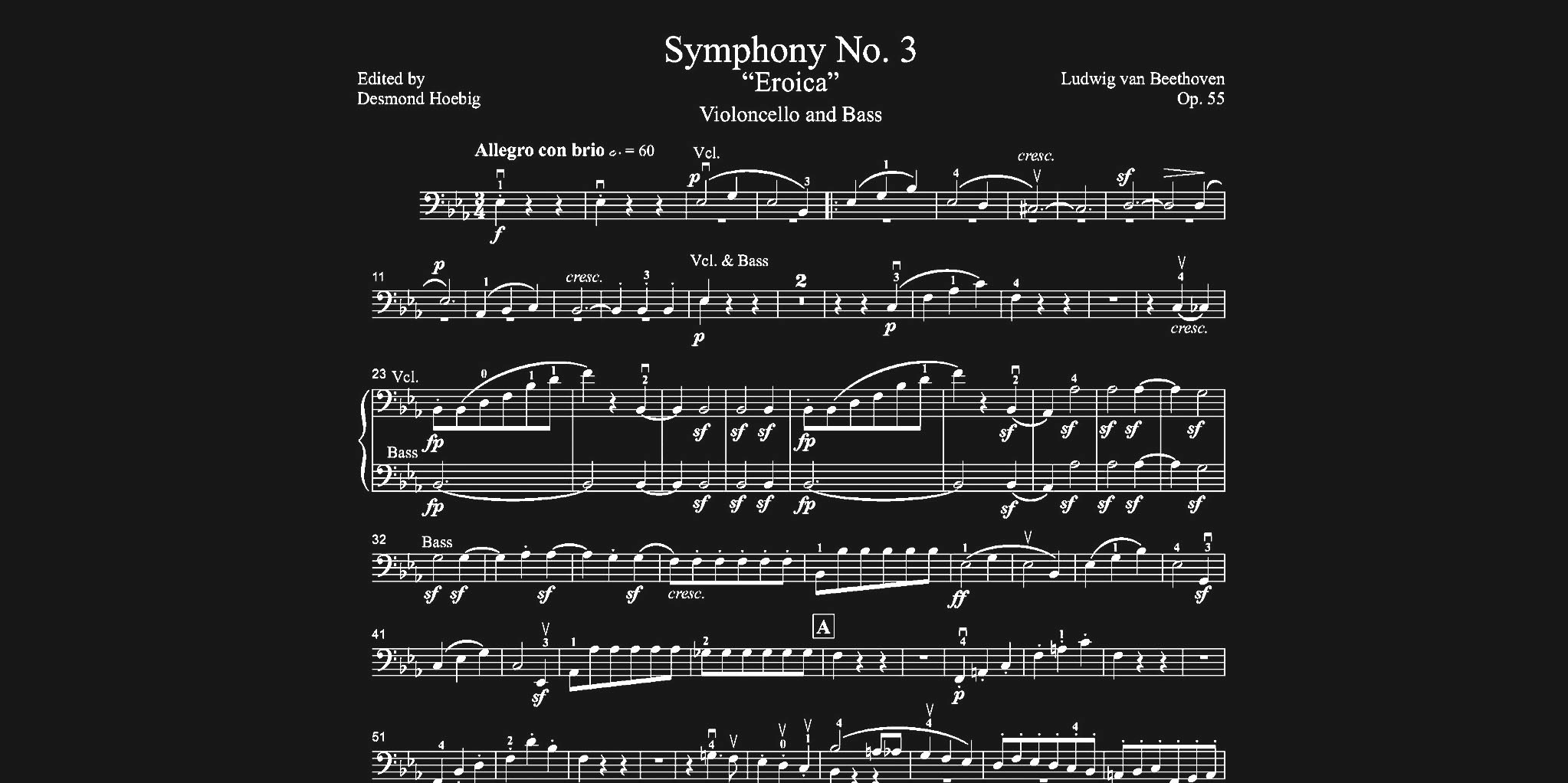
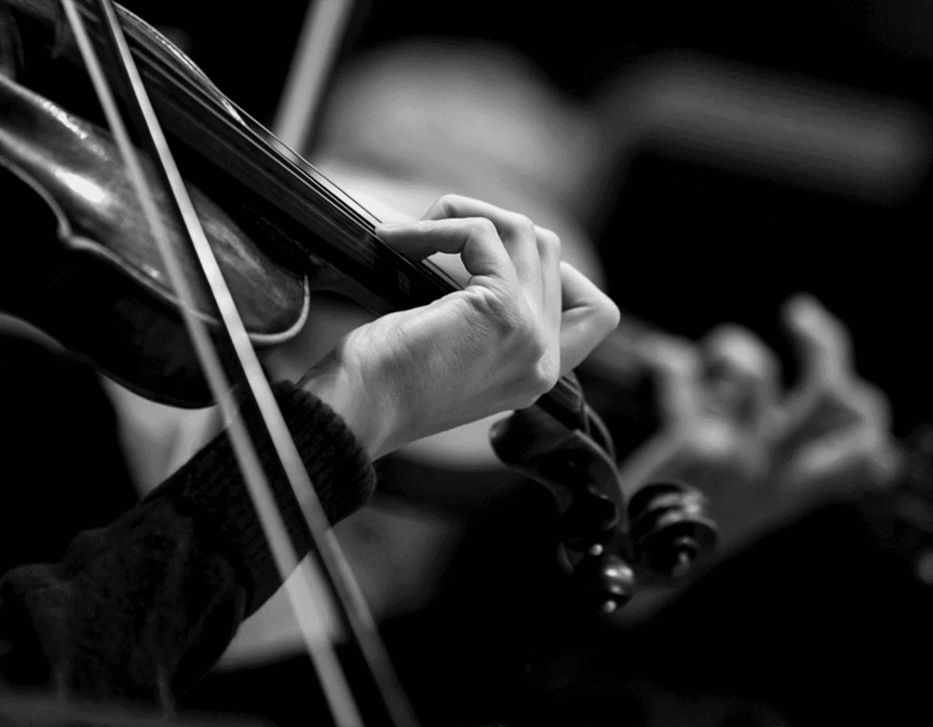
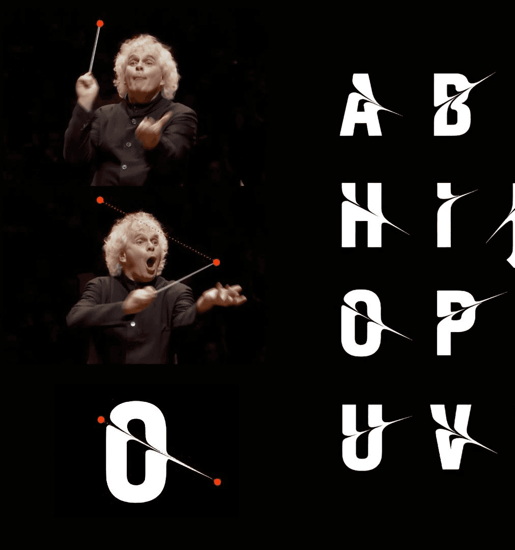
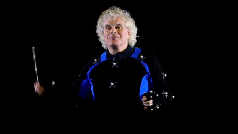
That summer, while reading Julie Steele's book Beautiful Visualization, I found myself imagining the transformation of language, how text could become an image, the image could turn into music, and music into numbers. This line of thought raised questions about the expansiveness and limitations of language and communication. It suddenly occurred to me, can I explore the same questions through the Eroica project?
That summer, while reading Julie Steele's book Beautiful Visualization, I found myself imagining the transformation of language, how text could become an image, the image could turn into music, and music into numbers. This line of thought raised questions about the expansiveness and limitations of language and communication. It suddenly occurred to me, can I explore the same questions through the Eroica project?






Design Concept / Sketch
Design Concept / Sketch
Design Concept /
Sketch
Symphony No.3
Symphony No.3
"Eroica," which means "heroic" in Italian, is also the name of Beethoven's 3rd Symphony. While working on the typeface, I often listened to classical music, and I was inspired to visually translate the fast pace, sharpness, and intricate dynamics of this symphony into the design.
"Eroica," which means "heroic" in Italian, is also the name of Beethoven's 3rd Symphony. While working on the typeface, I often listened to classical music, and I was inspired to visually translate the fast pace, sharpness, and intricate dynamics of this symphony into the design.
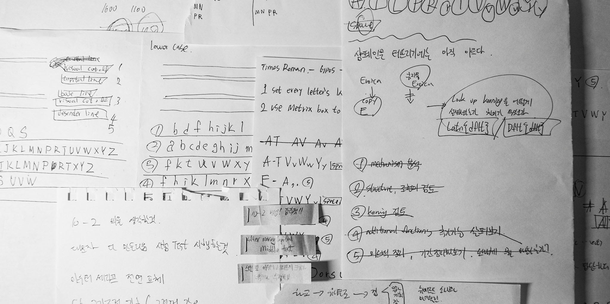


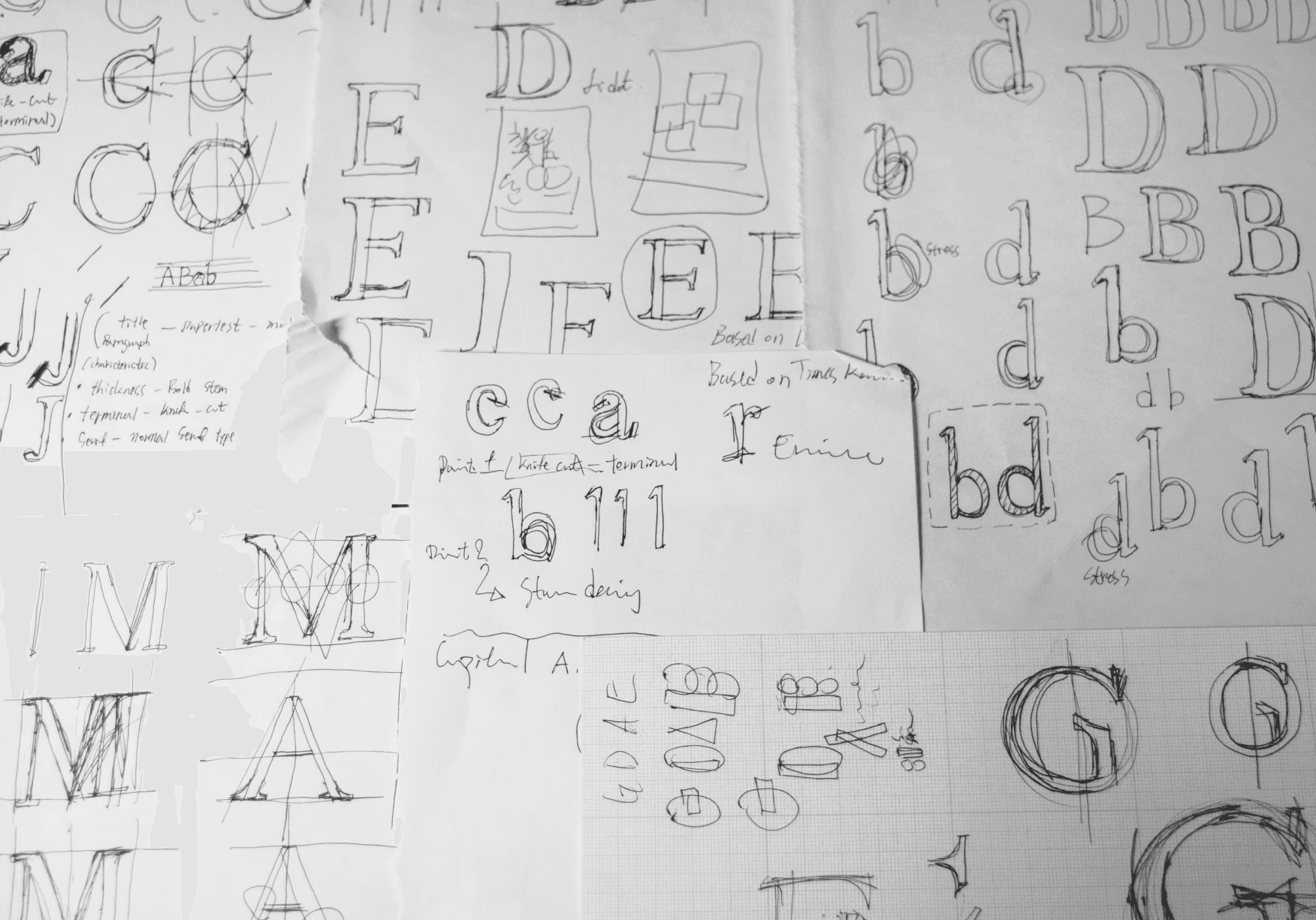




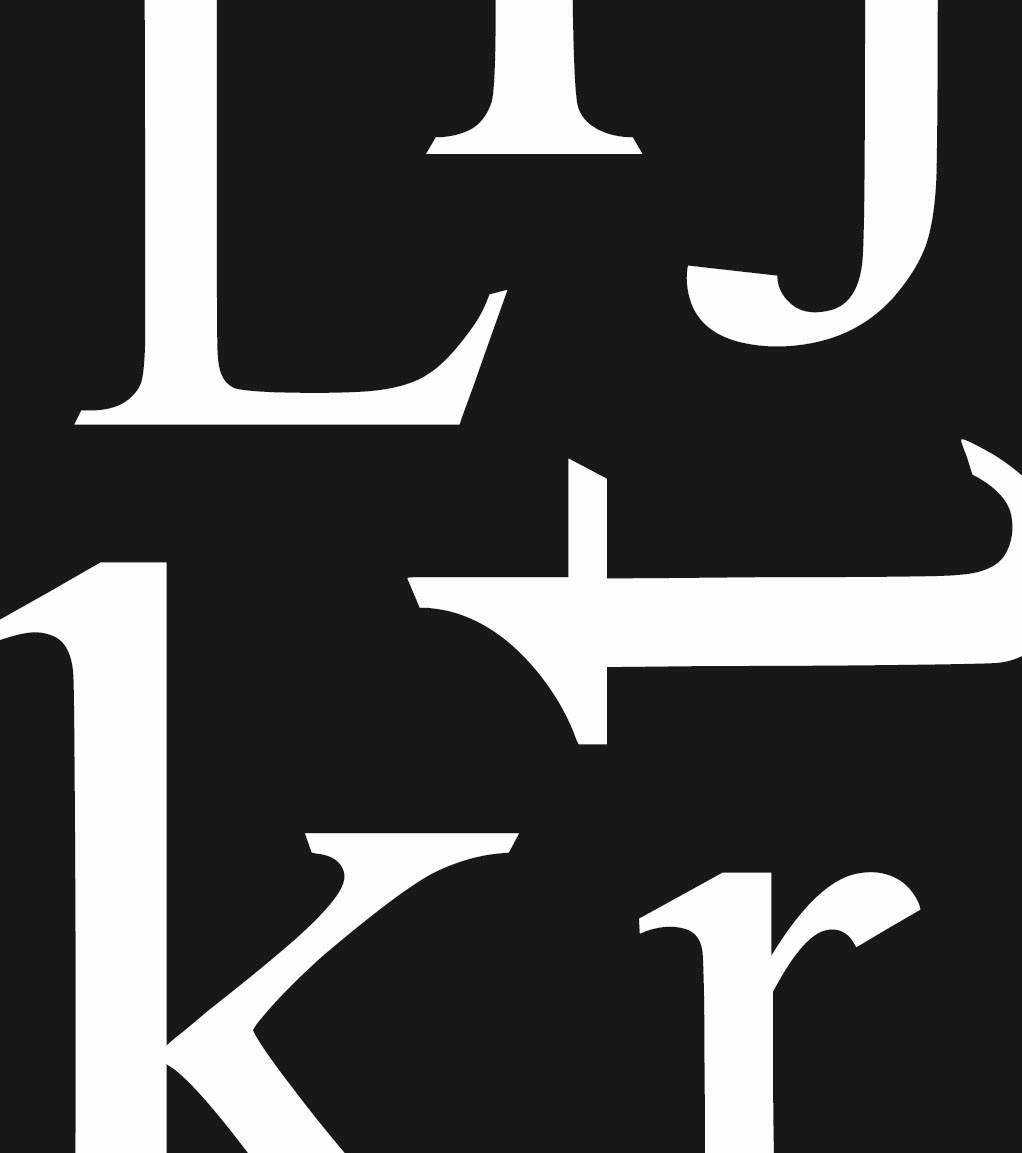


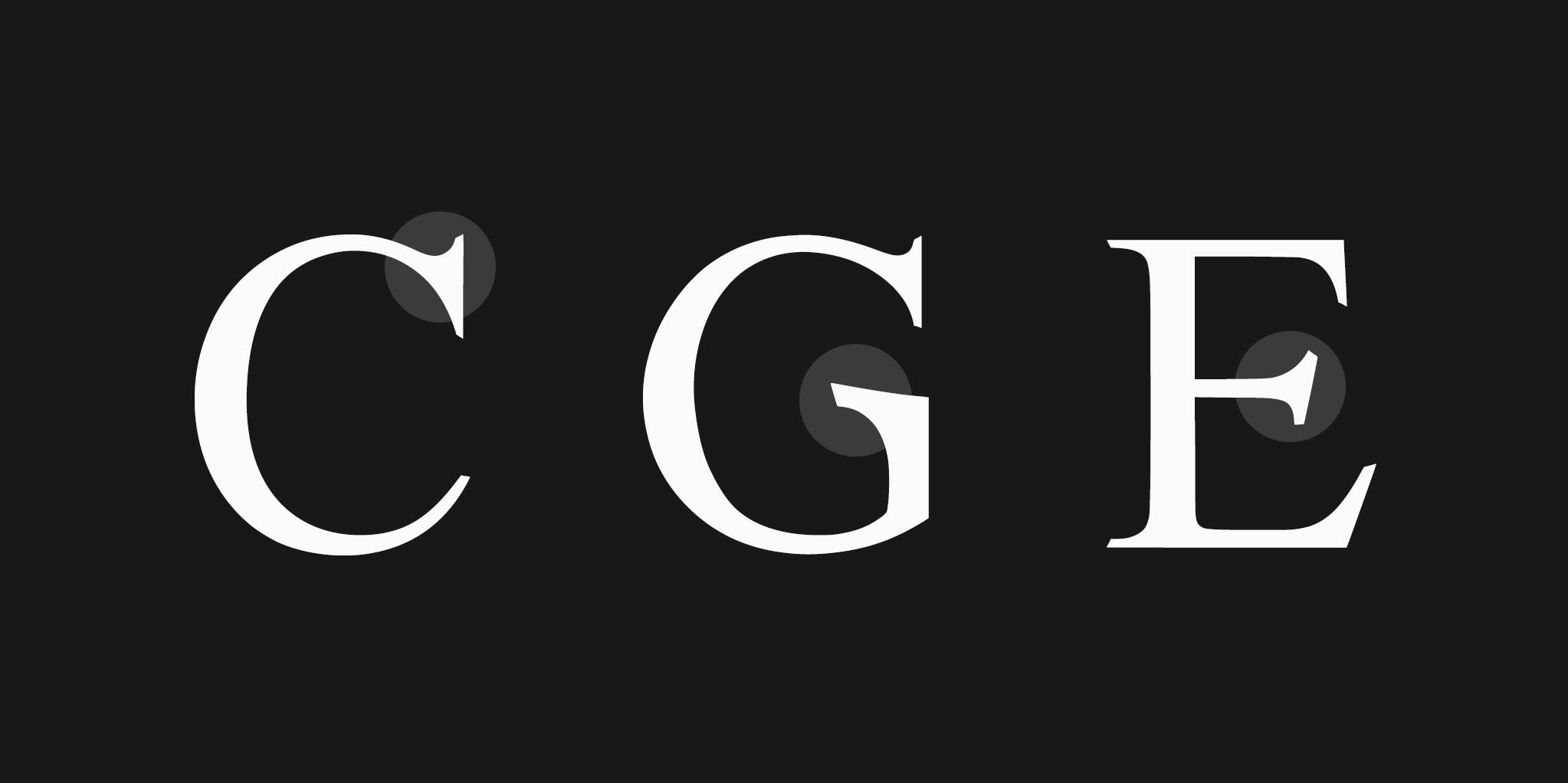


This influence is evident in the typeface's key features, such as the wide serif angles on letters like C, G, and S, and the asymmetric arms on G and E, which create a subtle tension.
This influence is evident in the typeface's key features, such as the wide serif angles on letters like C, G, and S, and the asymmetric arms on G and E, which create a subtle tension.
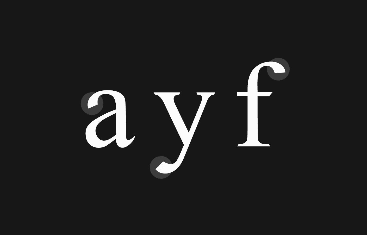


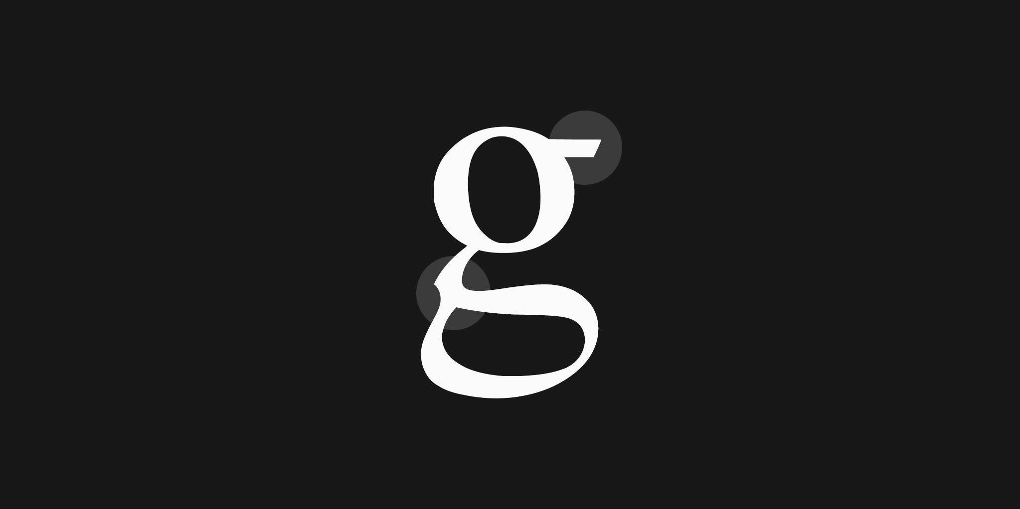


The sharp terminals on a, f, y, and j are a distinct characteristic of Eroica, replacing the more common rounded terminals with a knife-like edge. Even details like the ear and link of the letter 'g' were crafted to reflect the symphony's dynamic nature, all while preserving readability.
The sharp terminals on a, f, y, and j are a distinct characteristic of Eroica, replacing the more common rounded terminals with a knife-like edge. Even details like the ear and link of the letter 'g' were crafted to reflect the symphony's dynamic nature, all while preserving readability.
EfTG
EfTG
Press to see the differences
Times Eroica
Times New Roman
Digitization
Digitization
Optical Illusion / Ligature
Optical Illusion / Ligature
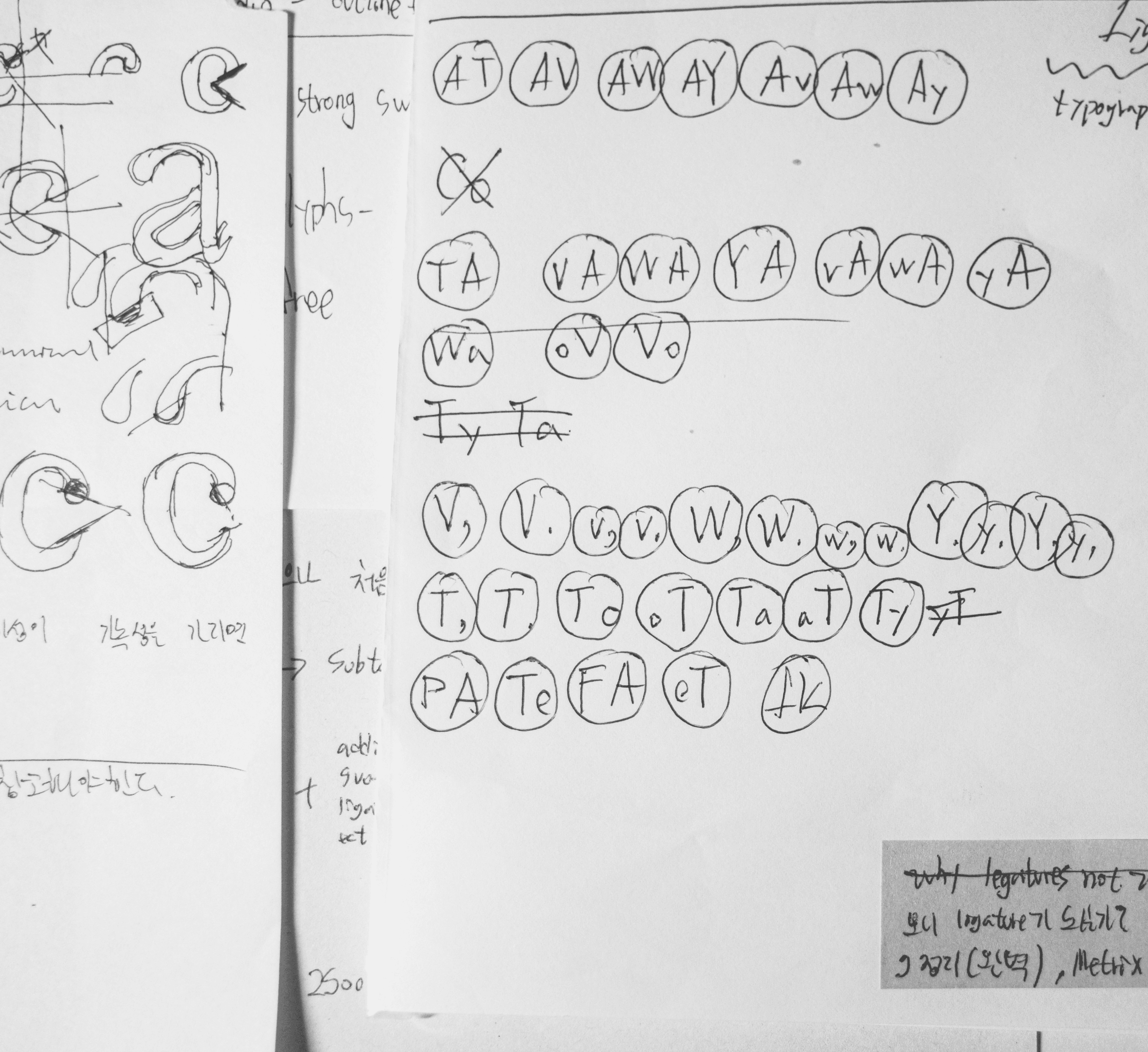
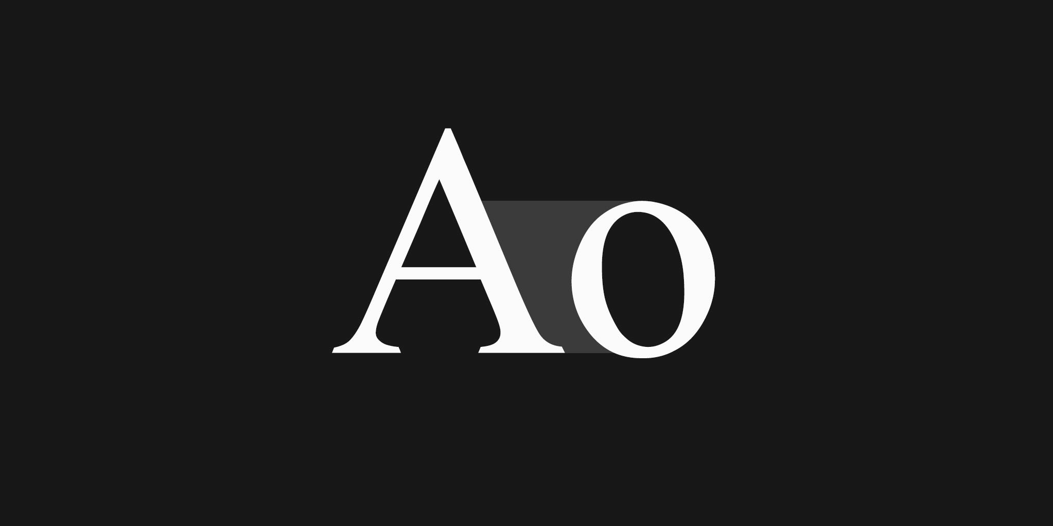
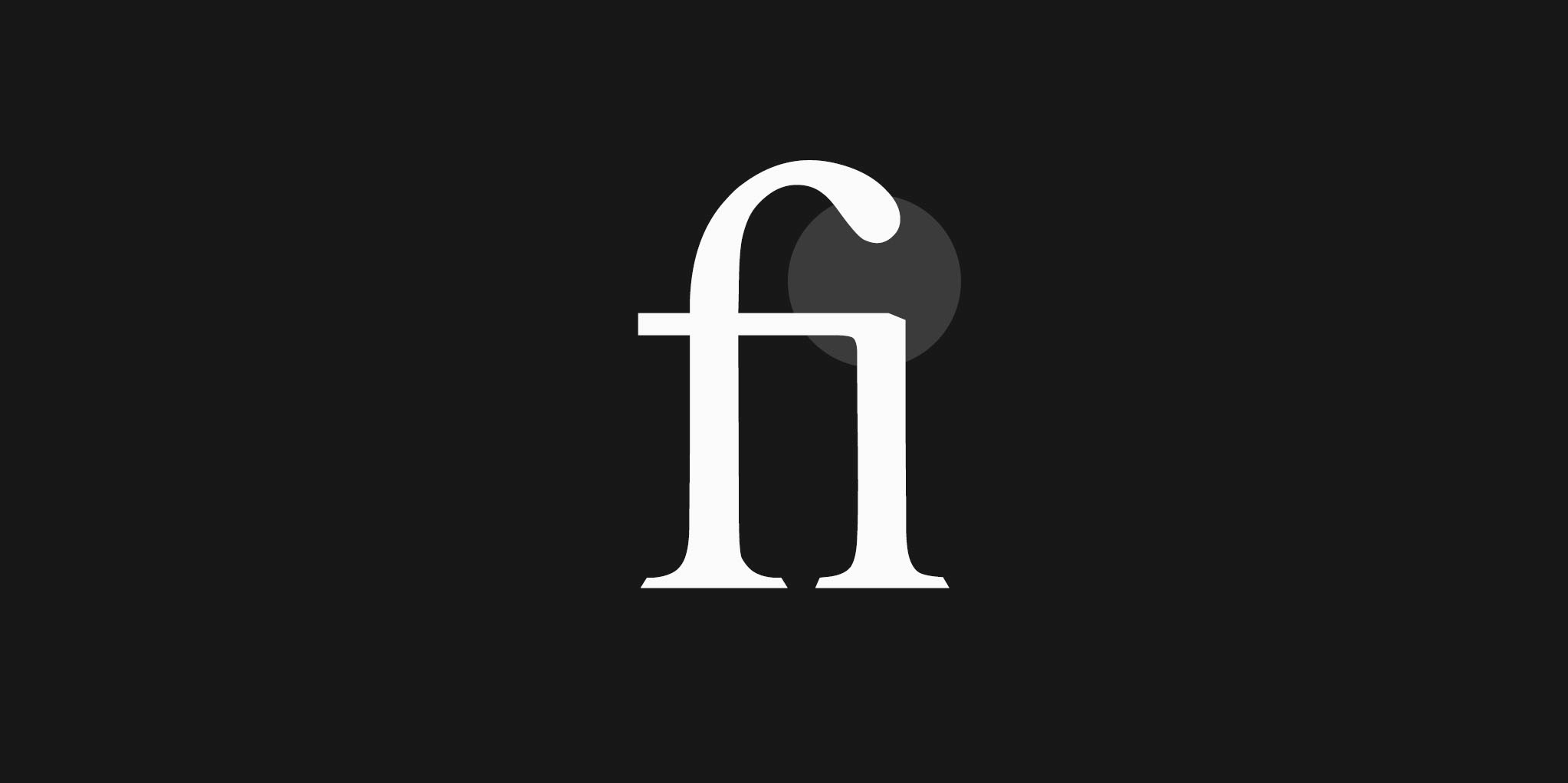
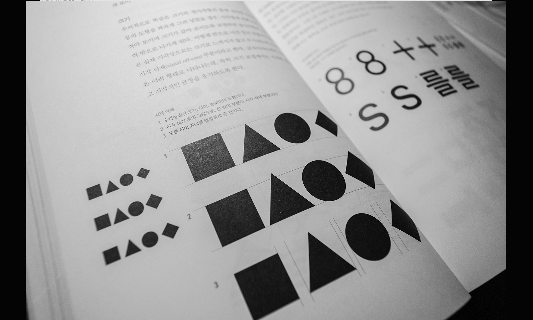
The biggest challenge in designing the typeface was managing optical illusions, like straight lines appearing curved and lowercase letters seeming to change size. Inspired by Akira Kobayashi’s idea that a good typeface should be visually comfortable, I focused on achieving a natural look. I also refined details like letter spacing and ligatures.
The biggest challenge in designing the typeface was managing optical illusions, like straight lines appearing curved and lowercase letters seeming to change size. Inspired by Akira Kobayashi’s idea that a good typeface should be visually comfortable, I focused on achieving a natural look. I also refined details like letter spacing and ligatures.




Extra Mile
Extra Mile
Typography in Digital
Typography in Digital
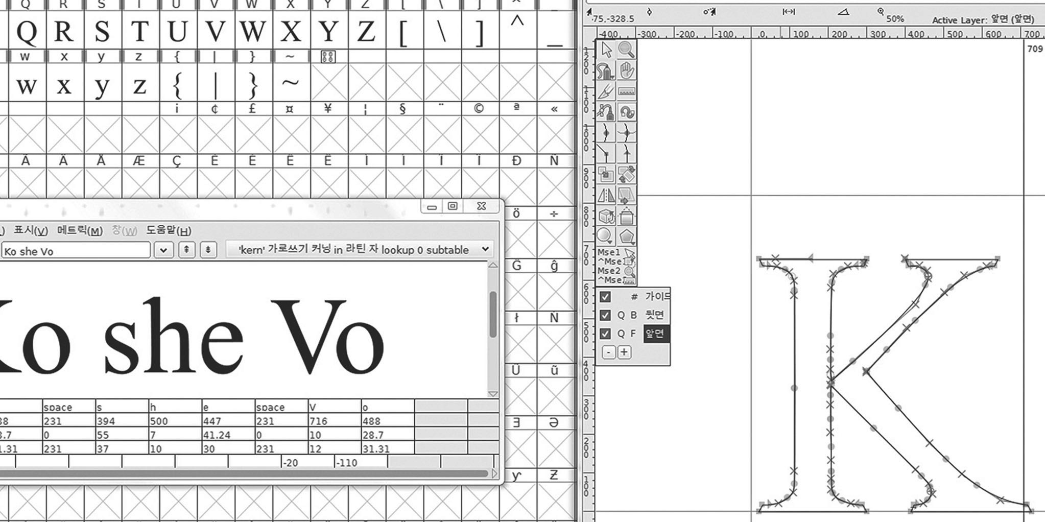
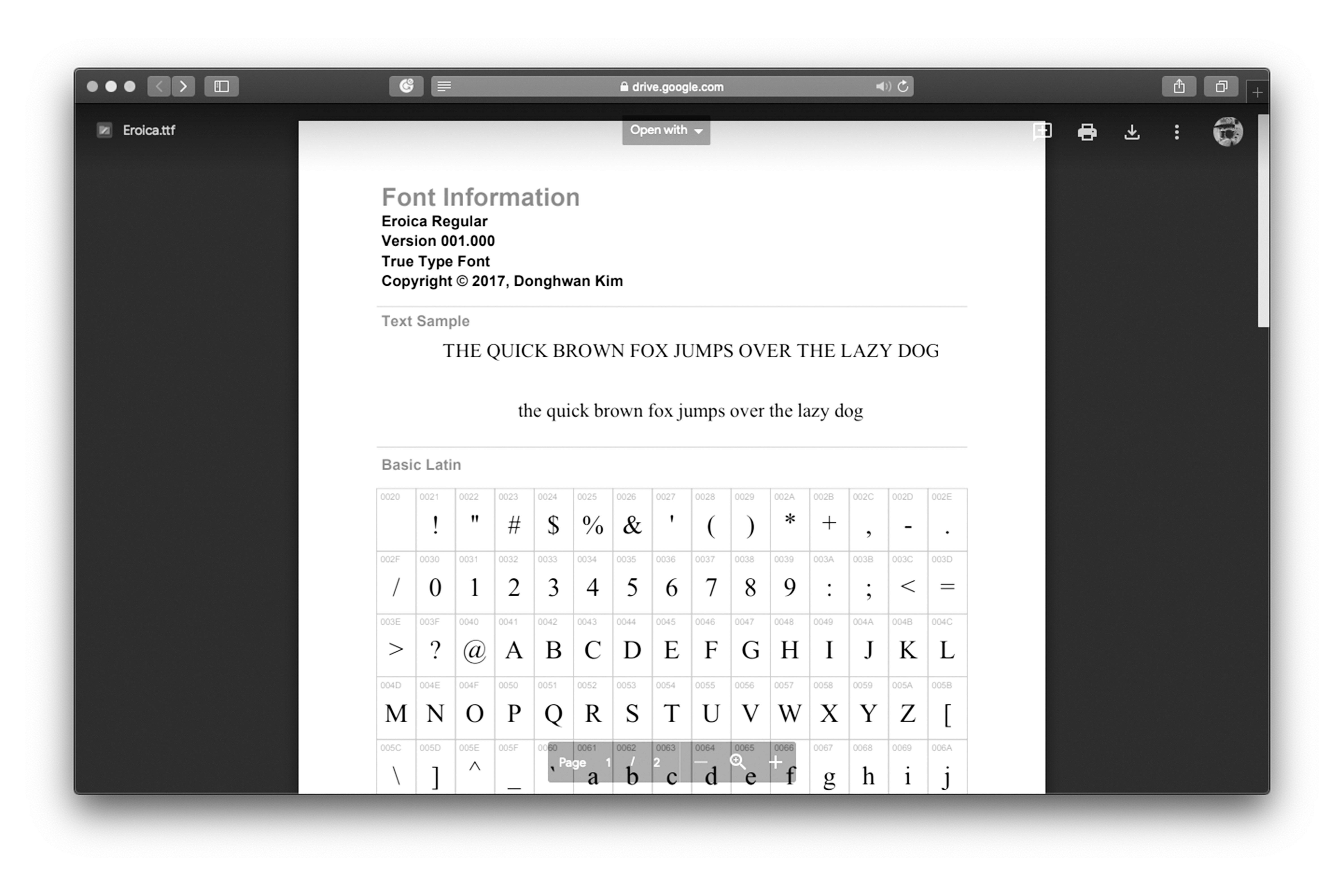
I also wanted to understand not just print, but digital typefaces as well. This led me to study the basics of web fonts, including font optimization and formats like WOFF2.
I also wanted to understand not just print, but digital typefaces as well. This led me to study the basics of web fonts, including font optimization and formats like WOFF2.












A
B
C
D
E
F
G
H
I
J
K
L
M
N
O
P
Q
R
S
T
U
V
W
X
Y
Z
A
B
C
D
E
F
G
H
I
J
K
L
M
N
O
P
Q
R
S
T
U
V
W
X
X
Y
Z
Times Eroica
Retrospect
Retrospect
Learning Independently,
Lack of Originality
Learning Independently,
Lack of Originality
I learned two key things from this project. First, I gained insight into the structure, concepts, and history of Korean and Latin typefaces. Second, I discovered how to study independently. With today’s interconnected knowledge, anyone can reach out to the past and explore future possibilities with a bit of effort.
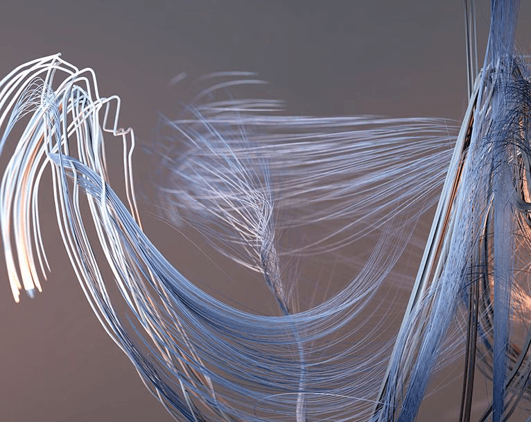
I regret relying solely on subjective impressions for my visualizations. I wonder if the project could have been enhanced with more advanced, mathematical visualizations. Later, I found out that the London Philharmonic’s identity was created using a similar approach, which made me wish I had pursued this avenue.






I am grateful to my mental mentors, Ham Hae-yang and Park Wan-gi, for their support, and to Lee Sae-bom from Yoon Design for their kind help.
I am grateful to my mental mentors, Ham Hae-yang and Park Wan-gi, for their support, and to Lee Sae-bom from Yoon Design for their kind help.
References
References
Designing with Type: The Essential Guide to Typography - James Craig, Irene Korol Scala
The Anatomy of Type: A Graphic Guide to 100 Typefaces - Stephen Coles, Erik Spiekermann
Hangeul Design - Ahn Sang-soo
Assignment 1. Typography - Kim Hyun-mee
Western Font - Akira Kobayashi
Beautiful Visualization - Julie Steele, Noah Iliinsky
Thoughts on Design - Paul Rand